Trac App
A day-by-day wearable fitness tracker concept designed to close the gap between intent and consistency
The wearable trend was slowing down. The smartphone was the device people already had with them.
In 2019, fitness wearables were losing ground. The segment — devices explicitly intended for fitness tracking, including wrist-worn activity trackers and smart clothes — was becoming saturated and commoditized. More importantly, the smartphones people already carried had the sensors, compute, and screen real estate to do everything a dedicated fitness band could do, and more.
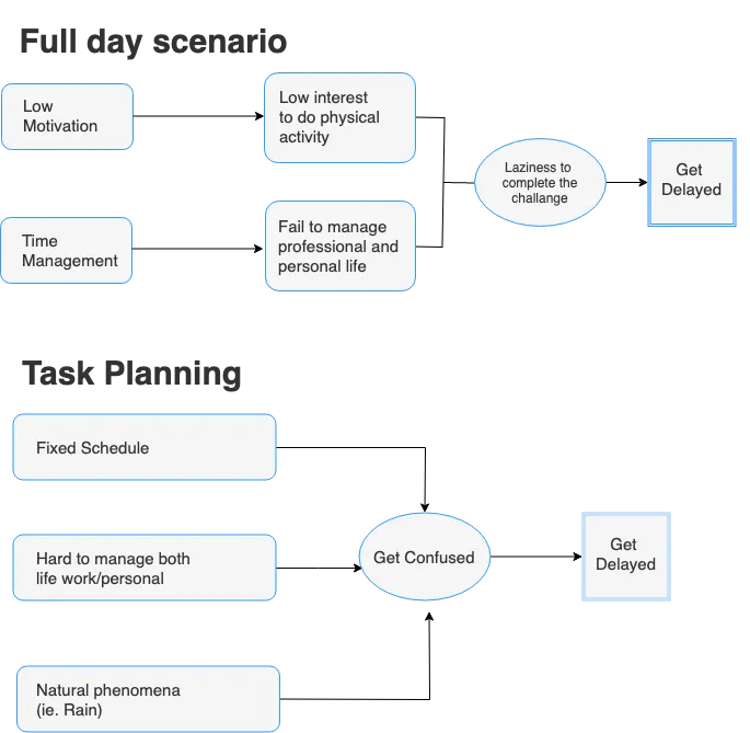
But the research also surfaced something the market data masked: people were not quitting fitness apps because the apps were bad at tracking. They were quitting because the apps were bad at motivating. High initial engagement, fast dropoff. The gap between intent and habit.
“People get so busy in their life that fitness falls away — not because they stopped caring, but because the apps gave them data without giving them a reason to keep going.”
This insight — that the core design problem was motivational continuity, not data capture — became the north star for Trac.
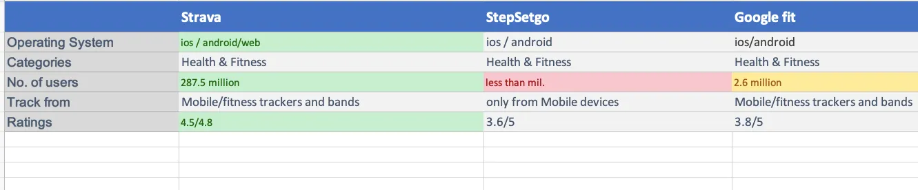
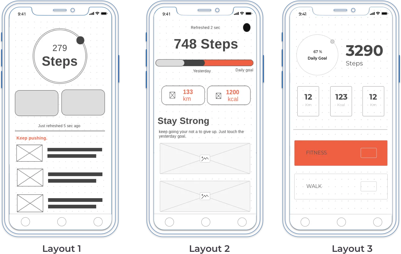
Competitive audit of the three most popular fitness apps in 2019: Strava, StepSetGo, and Google Fit.
I chose these three because together they covered the full landscape of fitness tracking at the time — Strava for performance-focused athletes, StepSetGo for gamified casual users, and Google Fit as the platform-native baseline. Each represented a different design philosophy and served a different user mindset.
| App | Strength | Weakness | Motivation model |
|---|---|---|---|
| Strava | Rich activity tracking, social segments, leaderboards | Overwhelming for casual users; designed for athletes, not beginners | Competition & social pressure — works for athletes, alienates newcomers |
| StepSetGo | Gamification, step-coin rewards, accessible entry point | Shallow depth; rewards feel arbitrary after initial novelty wears off | Extrinsic rewards — high initial engagement, fast decay |
| Google Fit | Deep device integration, clean data, Heart Points system | Cold, clinical feel; no personality; treats fitness as data, not behaviour | Health metrics — informative but not emotionally engaging |
The gap across all three: none of them prioritized daily emotional connection. They all optimized for what users tracked, not how users felt about tracking. Strava rewarded performance. StepSetGo rewarded completion. Google Fit rewarded consistency numerically. None of them treated the relationship between a user and their daily habit as something worth designing for.
That gap was the product opportunity for Trac.
Two personas defined by their relationship with consistency — not their fitness level.
Most fitness apps build personas around fitness level (beginner, intermediate, advanced). I found this framing unhelpful for a motivational product. The more relevant axis was relationship with habit: do you know what you need to do but struggle to sustain it, or are you actively engaged but worried about plateauing?
Frustration: Apps either make her feel bad for missing days or stop feeling relevant after the first week.
Frustration: Data-rich apps feel disconnected from long-term narrative. Can’t see the story his habits are telling.
The key insight across both personas: the problem was not data volume or tracking accuracy. It was meaning. Neither Priya nor Arjun needed more metrics. They needed the app to help them understand their own patterns and stay connected to them.
From research to design direction: three How Might We questions that anchored every decision.
Feature prioritization using MoSCoW:
- Daily activity tracking (auto-detect)
- Streak visualization
- Single focus metric per day
- Weekly summary card
- Contextual motivation messages
- Goal setting with milestones
- Heart rate + step integration
- Progress narrative (monthly story)
- Social sharing
- Wearable device sync
- Nutrition logging
- Lock-screen widget
The prioritization decision I am most confident in: keeping nutrition logging out of v1. Every competing app that tried to do food tracking alongside activity tracking ended up doing both poorly. The calorie-counting burden was one of the most cited reasons users abandoned fitness apps in my research. Trac would own one domain deeply — movement and habit — and defer food to integrations later.
Three design principles. Every screen tested against them.
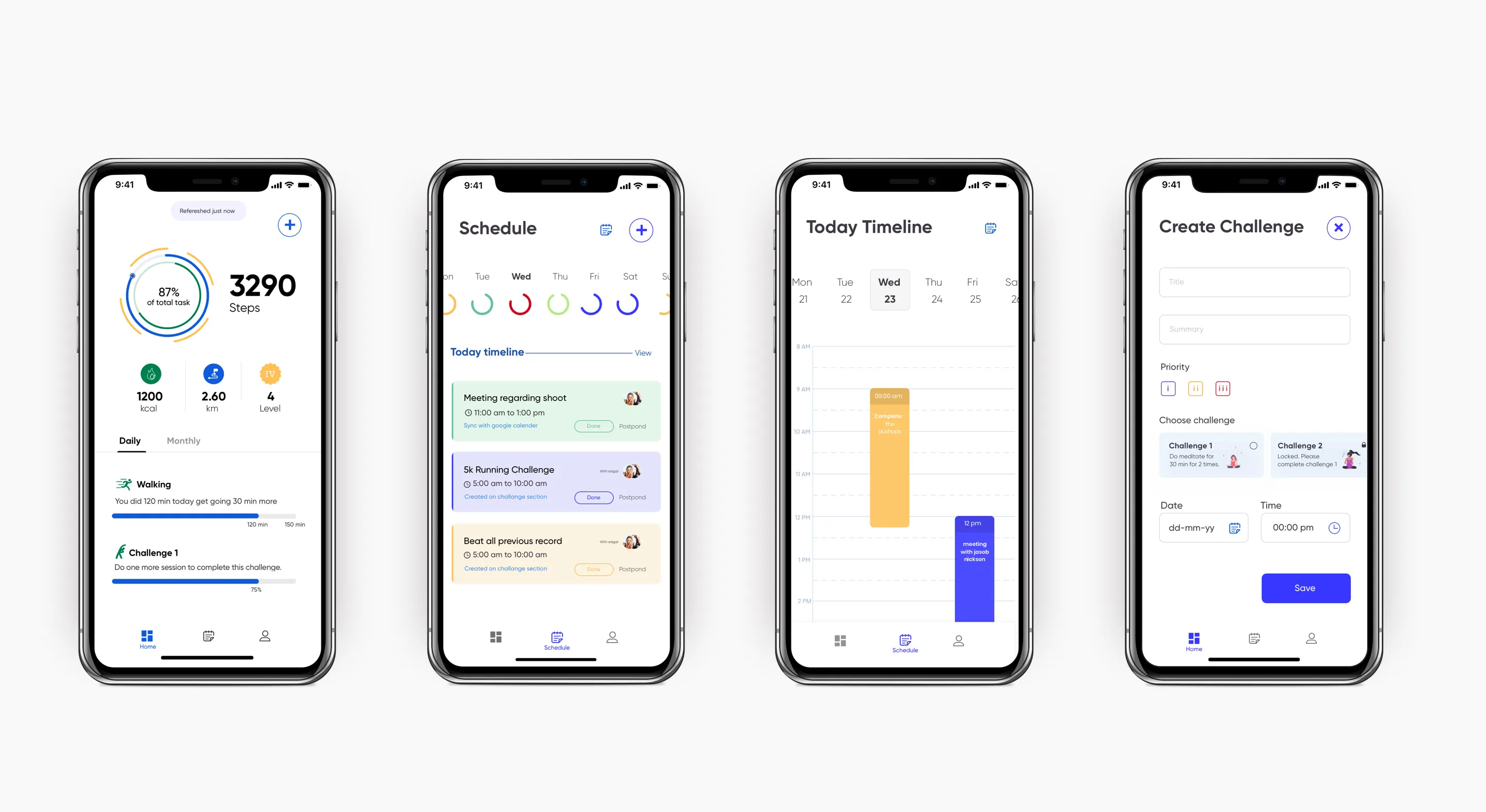
Key screens and the design reasoning behind each.
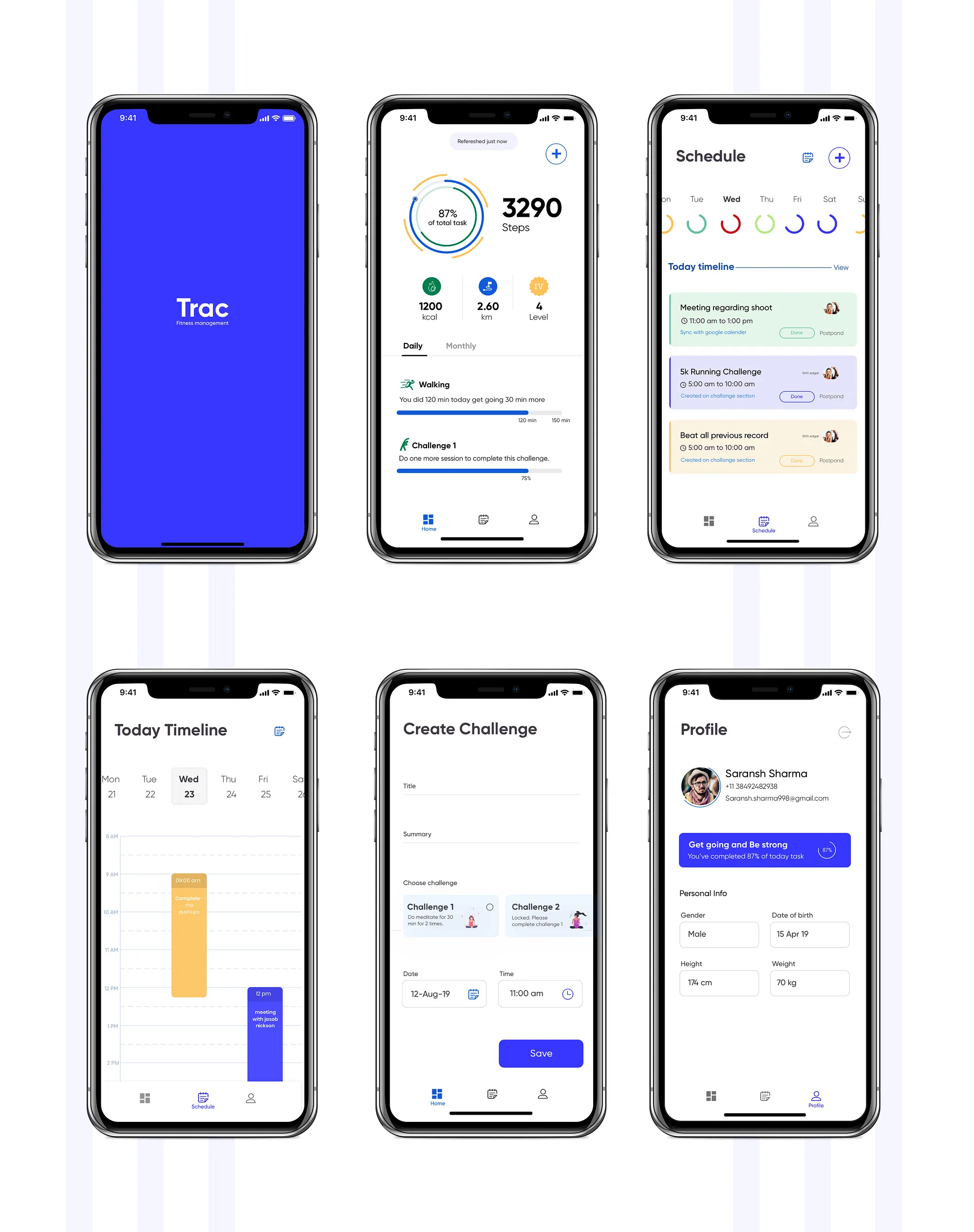
Design iterations: what changed and why.
What this project taught me about designing for behaviour change.
The research question is the design question. The reason Trac has a distinct point of view — one focus metric, streaks over PRs, narrative summaries — is that the research surfaced a specific, non-obvious problem: motivational continuity, not data accuracy. If I had started with “how do I build a better fitness tracker?” I would have built a better fitness tracker. Starting with “why do people stop using fitness trackers?” led to a completely different product direction.
Constraints are product decisions. Deliberately leaving nutrition logging out of v1 was not a scope compromise — it was a product decision grounded in research. Scope discipline is a form of product thinking. Every “we could add” is also a “we could dilute.”
Tone is an underrated design material. The weekly narrative card was the highest-differentiation feature in the concept — and it required no new data, no new tracking capability, no engineering complexity. It only required a decision about voice. How an app talks to users about their own behaviour shapes whether they feel judged or supported. That is a design decision with as much impact as any UI pattern.
What I would validate next. The single focus metric is the riskiest assumption in the product. It requires the algorithm to correctly infer which metric matters most today — and to be right often enough that users trust it. That inference model would need significant real-world testing to calibrate. The streak recovery framing would also need A/B testing against a traditional broken-streak state to measure whether it genuinely improves reactivation, or just feels better to designers.