Gameloft.com Revamp
Taking a global gaming pioneer from a 2008 website into a forward-thinking digital platform — without losing the two audiences that made it matter
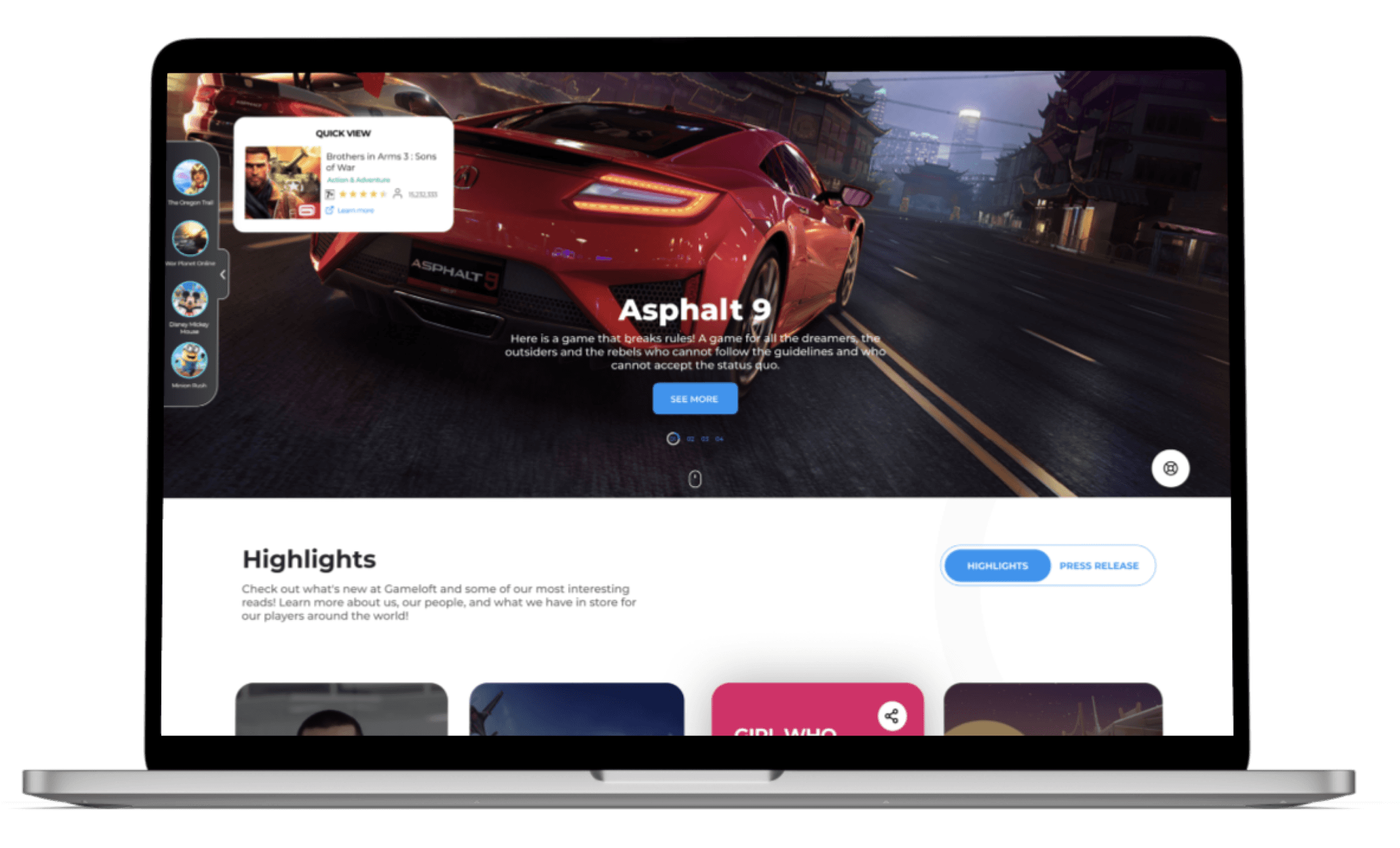
Walking into a modern gaming studio through a door from 2008.
That was my first mental model for the problem. Gameloft was pushing the limits of mobile gaming — creating console-quality experiences for hundreds of millions of players — while their website communicated none of it. Static pages, dated navigation, a structure built for a pre-smartphone world. The product did not match the promise.
My first move was not to open Figma. It was to spend two weeks inside the company: meeting stakeholders across product, marketing, partnerships, and engineering. I wanted to find the stories the website was failing to tell before I proposed how to tell them.
“The website wasn’t just showing its age — it was actively holding back the brand’s ability to engage with its global audience and potential business partners. That gap between product quality and platform quality was costing Gameloft real relationships.”
In parallel, I worked with our analytics team to understand actual user behavior. Google Analytics data and social media insights gave us a picture of how people really moved through the site — not how we assumed they did. The findings were uncomfortable: users were dropping off before finding what they came for. The navigation was opaque. Features people loved were buried. Partnership inquiries were hitting dead ends.
- High bounce rate on game discovery pages
- Partnership section underperforming — wrong audience, wrong language
- Community content completely absent from the main experience
- No mobile-first approach despite a mobile-gaming audience
- Navigation structure reflected internal org, not user goals
- Partnership teams manually filling gaps the website left
- Marketing frustrated that campaigns drove traffic to an underperforming funnel
- Community managers proud of social presence but unable to showcase it
- Product teams whose games had no proper home on the platform
One platform. Two fundamentally different audiences. That tension is the whole design problem.
The research crystallized quickly around a structural contradiction: Gameloft needed its website to simultaneously excite a teenager downloading their first mobile game and impress a potential business partner evaluating a partnership opportunity. These two users have almost nothing in common — different goals, different vocabulary, different expectations of trust, different visual preferences.
Most websites in this situation choose one and under-serve the other. My design mandate was to resolve the tension rather than sidestep it.
- Discover new games quickly and intuitively
- Feel the energy and community behind the brand
- Access trending titles without friction
- See their platform (social, mobile) represented
- Be entertained, not lectured at
- Understand Gameloft’s scale and credibility instantly
- Find the partnership pathway without friction
- See evidence of reach, quality, and professionalism
- Experience a brand that matches enterprise standards
- Trust the company behind the games
The design challenge I wrote for the team: Design one surface that can shift register instantly — from playful and immersive to professional and credible — depending on where you are and what you’re looking for.
Three structural ideas before we landed on the architecture that worked.
-
01Split-site model (killed in concept phase) Two entirely separate entry points — one for players, one for partners. Clean in theory. Killed because it doubled the maintenance burden, split SEO authority, and created an identity crisis: Gameloft is one brand, not two. Splitting the site would fracture what we were trying to build.
-
02Role-selection onboarding (tested and dropped) A landing page that asks “Are you a player or a partner?” on arrival. Familiar pattern, but tested poorly — players found it patronizing, partners found it slow. Nobody wants to declare their identity before they’ve experienced anything.
-
03Layered single-site architecture ✔ One coherent experience where the hero communicates energy and scale simultaneously. A navigation system that leads both audiences to their respective destinations without announcing the bifurcation. Dedicated sections for each persona, but woven into a unified visual language. This survived because it served both audiences without asking either of them to choose.
The Vivendi design system was introduced at this stage — not as a style guide, but as the structural foundation that would make a single platform feel coherent across wildly different content types, from game trailers to partnership documentation.
Three growth elements built from scratch, each solving a specific gap identified in research.
The Vivendi design system governed every component decision. Consistency was not optional — with 10+ product teams across 3 global studios contributing to the platform, a shared system was the only way to ship at Gameloft’s scale without the site fragmenting visually.
“The Vivendi system was the invisible design work that made the visible design work. Without it, we would have shipped 30+ components that looked related but didn’t cohere. With it, every new page, every new feature, every new market implementation felt like it belonged.”

A/B testing and data-driven iteration — not every decision survived contact with users.
I established Gameloft’s A/B testing framework for the website as part of this project. The principle: no design decision is final until users confirm it. We ran structured experiments across the major interaction points — navigation, game discovery, partnership CTA placement, and community content prominence.
-
✔Community wall placement — validated Placing the social feed in a prominent mid-page position significantly outperformed a sidebar treatment. Users spent more time engaging with community content when it was woven into the main scroll rather than tucked to the side.
-
✔Play Store navigation pattern — validated Users recognized the app-store mental model immediately. Task completion time for finding a specific game dropped significantly compared to the old category navigation.
-
✕Original hero animation treatment — revised Our first hero used heavy video backgrounds that tested poorly on lower-bandwidth connections — a significant portion of Gameloft’s international audience. Replaced with a performance-conscious motion system that preserved visual energy without the load cost.
-
✕Partnership section copy — revised Original partnership section used gaming language that tested well with internal teams but confused actual business visitors. Rewrote in partnership-native vocabulary after user testing with business stakeholders from target companies.
The willingness to kill decisions — including ones I was personally attached to — was what made the A/B framework credible to the team. Data-driven design only works if the designer is genuinely willing to be wrong.
Real results. Real recognition.
The platform became the foundation for subsequent product launches — including dedicated high-impact homepages for Lego, Disney, and Microsoft partnerships. Each of those was possible because the design system and architecture were already in place.
What leading a team through a platform transformation at scale taught me.
The research phase is the leverage point. Two weeks of stakeholder conversations and analytics immersion before touching Figma produced better design decisions than any amount of visual exploration could have. The hidden stories — the community that wasn’t being showcased, the partnership pathway that was failing invisibly — only surfaced because I went looking for them before I started designing.
A design system is an organizational decision as much as a design decision. Introducing Vivendi was not primarily about visual consistency — it was about creating a shared language that let 6 designers across 3 time zones ship coherently without constant coordination overhead. The system made the team more autonomous, not less. That is the goal of a design system: to scale judgment, not impose taste.
The A/B framework changed how the team related to their own work. Once designers knew their decisions would be tested, the attachment to specific solutions decreased and the attachment to user outcomes increased. That is the healthiest shift a design culture can make. I would establish an A/B infrastructure earlier in every future project.
Serving two audiences simultaneously is harder than it looks and more valuable than serving one well. The temptation was always to optimize for one persona. Resisting that temptation — and designing an architecture that genuinely served both — was the hardest and most important decision in the project.