Cyvl.ai
Redesigning a geospatial road intelligence platform so government infrastructure teams can actually use it
Two problems in one project: an industry challenge and a platform challenge.
Before redesigning anything, I needed to understand what Cyvl actually is and who uses it. Cyvl sits at the intersection of physical infrastructure and data science — their sensors map road conditions, and their cloud platform turns that data into actionable maintenance recommendations for government agencies. The technology is sophisticated; the audience is not technical.
- Traditional inspection methods are manual and time-consuming
- Workers face physical risk during on-site assessments
- Data collected is often inconsistent and hard to compare
- Budget decisions rely on outdated or incomplete road condition data
- Confusing navigation with no clear hierarchy
- Inconsistent visual language and branding
- Complex site structure obscures core workflows
- Users struggle to locate information and complete tasks
“The technology was solving the right problem. The interface was getting in the way of the solution.”
Three objectives to anchor every design decision.
-
01Intuitive, streamlined navigationUsers should be able to find what they need without training. Navigation should match mental models already formed by the tools infrastructure teams use daily.
-
02Modern design aligned with brand identityThe platform should feel as sophisticated as the underlying technology. Visual language should build confidence, not confusion.
-
03New features grounded in real user needsFeatures should emerge from persona-driven research — not assumptions about what government officials or engineers might want.
Three distinct personas — each with fundamentally different goals and mental models.
The challenge of designing for three such different personas was resolving the tension between simplicity for government officials and depth for GIS specialists — on the same platform, in the same interface.
A multi-method research approach for a constrained timeline.
“The multi-method approach was a deliberate choice: interviews give you the why, contextual inquiry gives you the reality, and surveys give you the confidence to prioritize. Each method compensates for the blind spots of the others.”
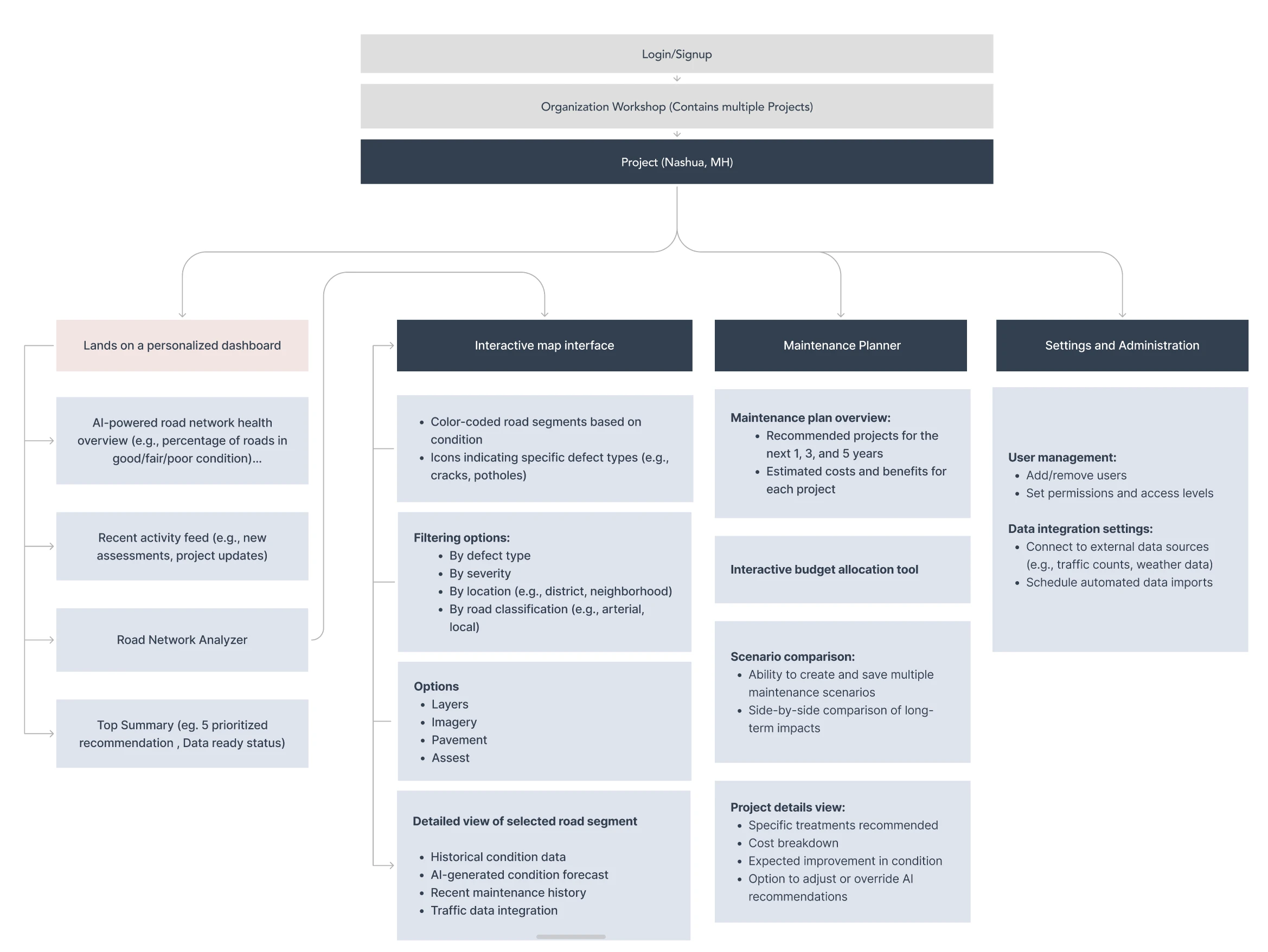
Four structural decisions that drove the new platform architecture.
-
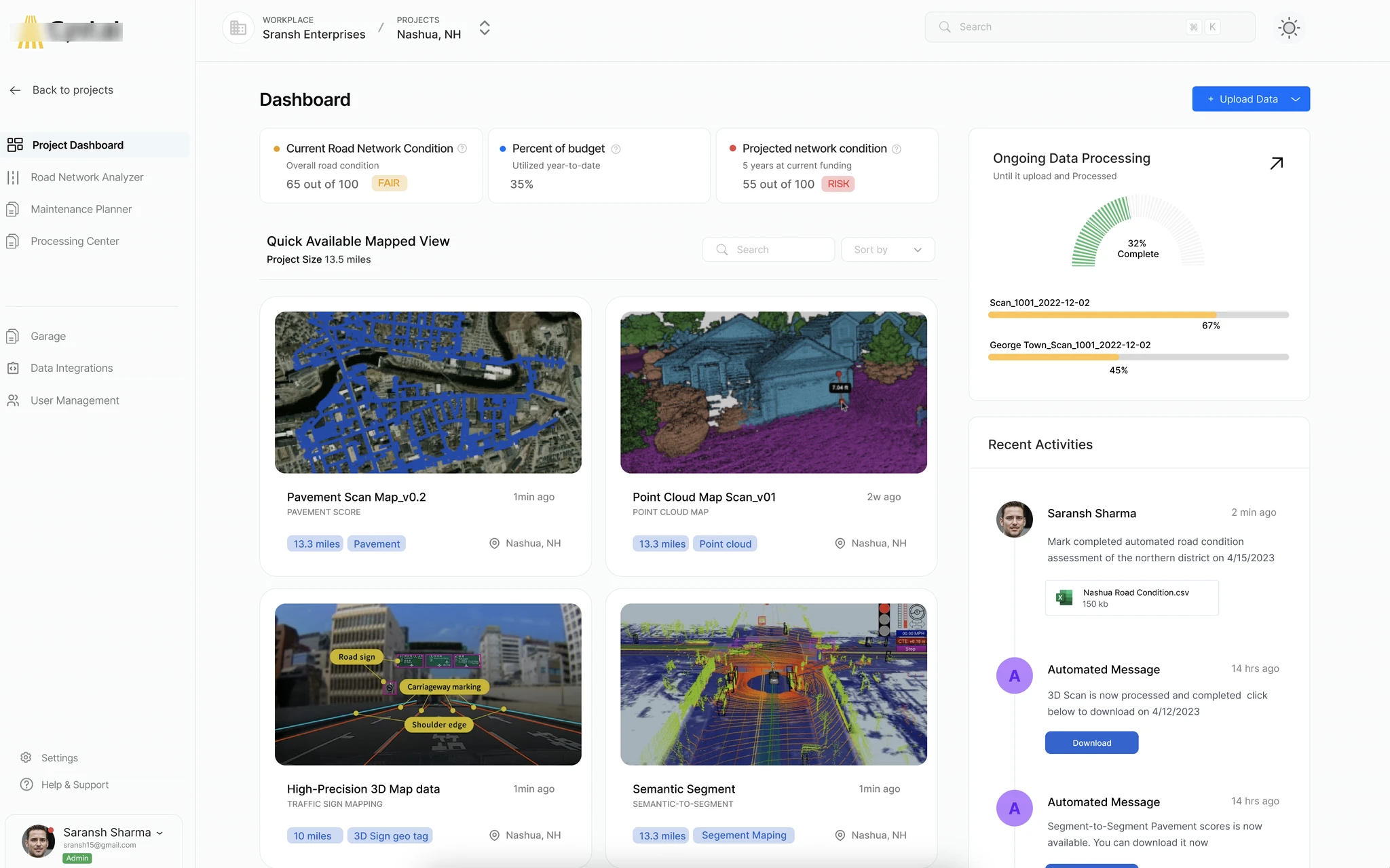
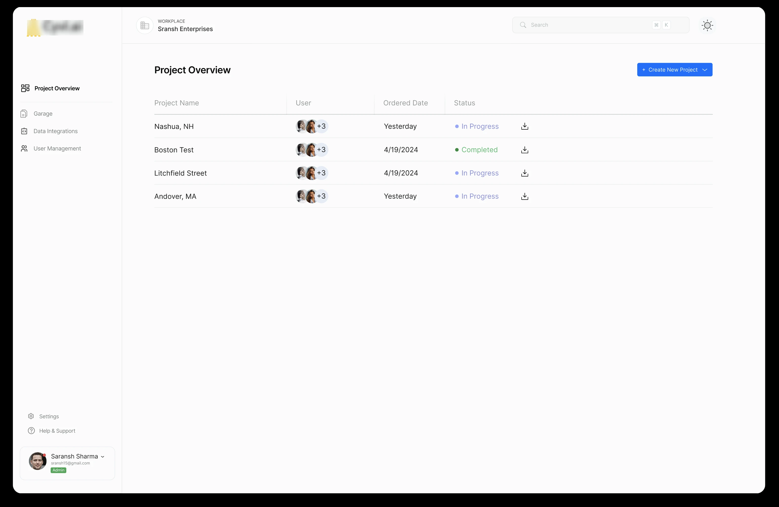
01Personalized dashboard as entry point Each persona sees a dashboard configured for their role on login. Government officials see prioritized budget recommendations. Project managers see active projects and timeline status. GIS specialists see their map views and recent data layers. One platform, three contextual entry points — without three separate products.
-
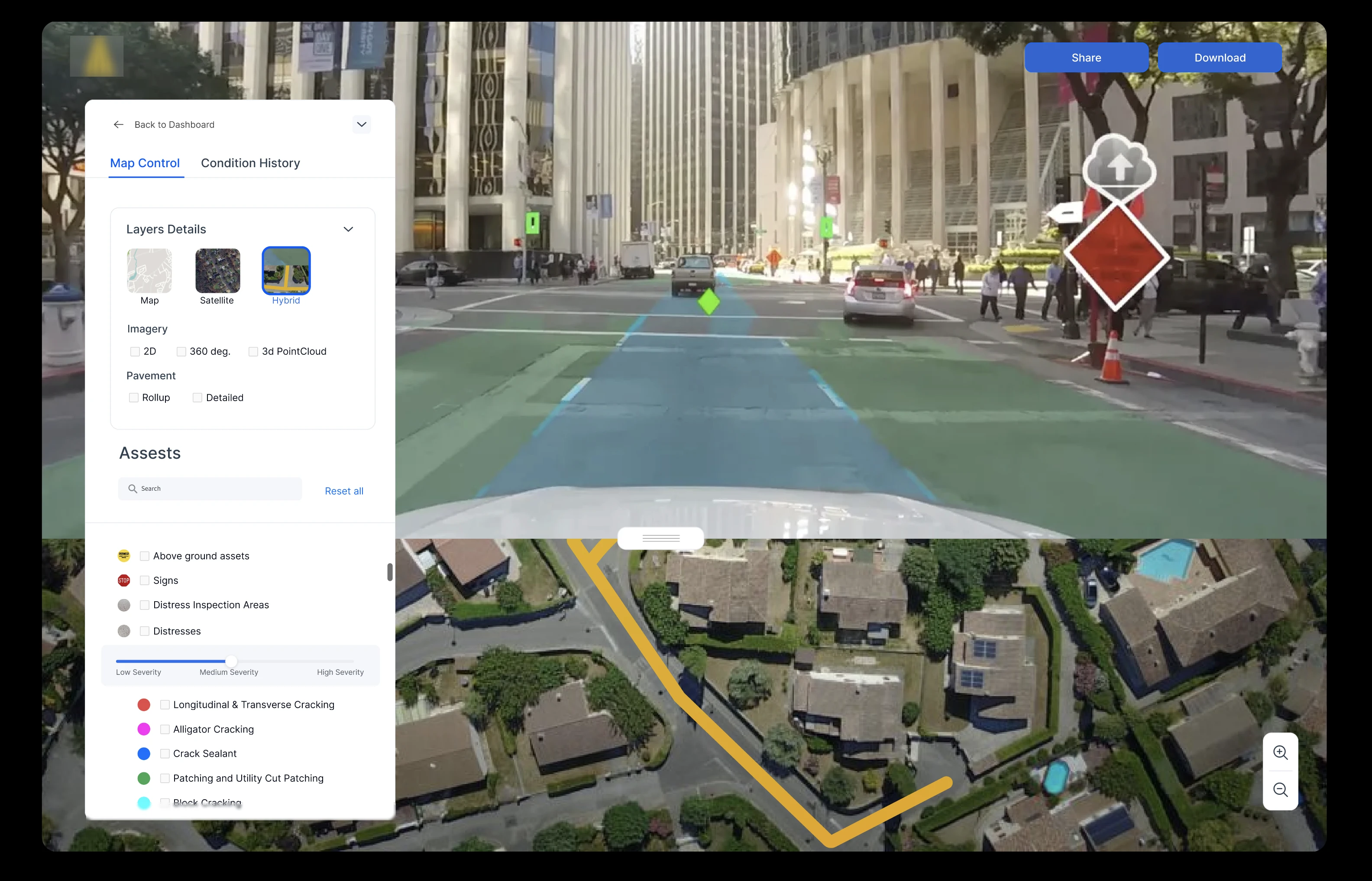
02Interactive map as the primary interface surface Road data is inherently spatial. The map is not a feature — it is the center of gravity. Every other surface (reports, recommendations, budget tools) is an extension of the map. This decision aligned with how all three personas naturally think about road conditions: geographically.
-
03Maintenance planner with AI-generated recommendations Government officials cannot interpret raw pavement condition index data. They need curated, prioritized recommendations with projected impact and cost. The maintenance planner translates sensor data into budget-ready action plans — reducing the cognitive load on non-technical decision-makers.
-
04Role-adaptive settings and administration Organizations structure differently. The settings layer needed to support custom user hierarchies, role assignments, and data access controls so the platform adapts to how each government agency operates — not the other way around.
Before → After: what changed.
- Flat, undifferentiated navigation with no role context
- Map buried as a secondary feature
- Raw data tables with no interpretive layer
- Inconsistent visual system with no clear hierarchy
- One interface trying to serve all users equally badly
- Role-personalized dashboard as the entry point
- Map as the primary interface surface
- AI-generated maintenance recommendations with budget context
- Cohesive visual system built on Cyvl brand identity
- Progressive disclosure: simple by default, detailed on demand
An interactive prototype built for stakeholder review, not just internal critique.
The prototype covered four primary flows:
- Onboarding to dashboard — login → role-contextual summary → priority action
- Map exploration — filter by road condition → select a segment → view detailed assessment
- Maintenance planning — review AI-generated recommendations → adjust budget allocation → generate report
- Settings and user management — add team member → assign role → set data access permissions
The prototype was built at high fidelity to give stakeholders — including the CEO — a realistic sense of the new visual language, not just the structure. Low-fidelity wireframes were used internally during design iteration; stakeholder review required something that reflected the real product direction.
“The prototype was the most important deliverable in this sprint — not because it showed the final product, but because it created a shared language between design, engineering, and leadership for what we were building toward.”
Projected improvements based on research findings and comparable platform redesigns.
What this sprint proved beyond the numbers:
- Role-based personalization is the correct architectural direction for a platform serving fundamentally different user types
- Making the map the center of the product — not a tab within it — aligns the interface with users’ actual mental models
- Government officials need interpretive layers over raw data; GIS specialists need access to the raw data underneath. Both are valid. Neither should compromise the other.
What 15 days taught me about designing for regulated, data-heavy domains.
Constraint is generative. Fifteen days sounds short for a platform redesign. It forced every decision to be deliberate. There was no time for exploration that did not serve a defined objective. The sprint structure — discover, define, design, prototype, test — gave the work momentum and the stakeholders visibility at every stage.
The GIS specialist is the canary in the coal mine. In complex platforms, power users reveal the structural weaknesses that casual users simply work around. Designing for GIS specialists first — then layering simplicity on top for officials and managers — produced a more honest architecture than starting from the simplest user up.
Predicted impact is not a hedge — it is a commitment. Stating metrics as predictive is not epistemic cowardice. It is the right design posture. The sprint produced a strong foundation; validation is a distinct phase with its own methodology. Separating the two is professional, not cautious.